Phones, Outlook and dark mode
Check how your email looks on phones, tablets and in different email programs before you send it.
In this lesson
- Preview on every device at once
- Know what changes on phones
- Understand what classic Outlook and dark mode do to an email
Phones and tablets
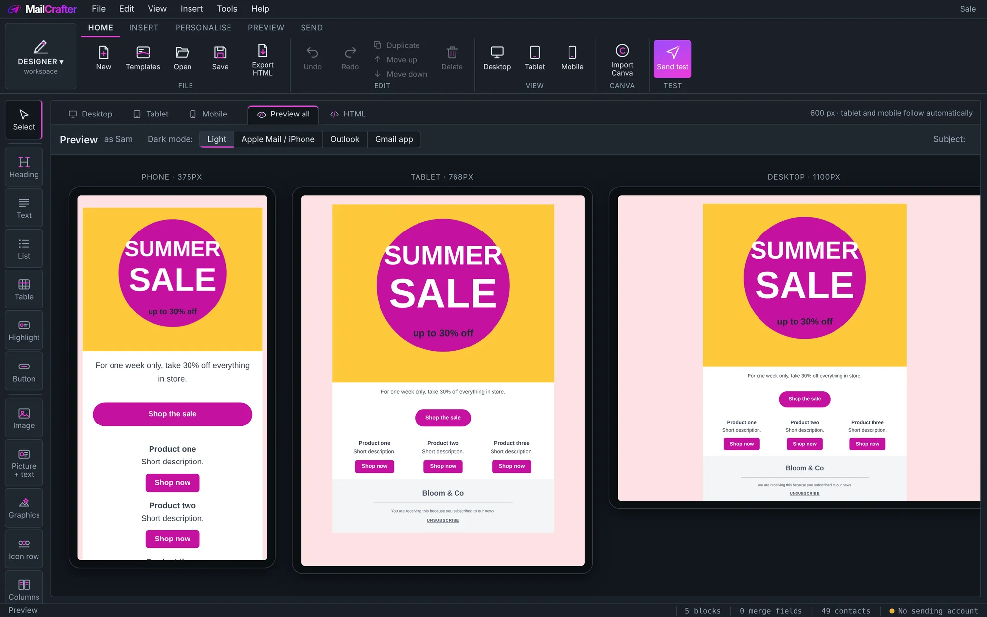
You design on the Desktop view; tablets and phones follow. On phones, columns stack, buttons can widen, and text sizes stay readable. The phone preview beside the email updates as you work. Click Preview all to see phone, tablet and desktop side by side.
To show a block only on one kind of device, use Visibility at the bottom of its properties.
Different email programs
In Preview all, the buttons along the top preview the email as Apple Mail / iPhone, Outlook and the Gmail app show it, and as a chosen subscriber with Preview as.
Classic Outlook on Windows draws emails with Microsoft Word's engine, which can't do rounded corners, stretched pictures or layered banners. MailCrafter prepares those for it when you send: rounded corners become pictures, heroes are merged into one picture, and a full-width email is shown as a neat centred email instead of a broken stretched one.
Dark mode
Many people read email with dark mode on, and their email program may darken your colours. On the Preview tab, Dark mode shows what that looks like. In Email settings you can keep the email as designed, or choose your own dark colours for readers who use dark mode.
Revision history
| Revision | Date | What changed |
|---|---|---|
| 1 | 21 November 2026 | First edition. |